After 40 years on the air, ESPN had transitioned from cable upstarts to the establishment of the sporting world. They still offered the best coverage and analysis, but, for the average fan, ESPN wasn't top of mind. They just . . . were. Omnipresent yet forgettable.
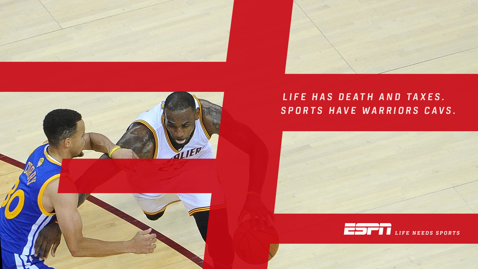
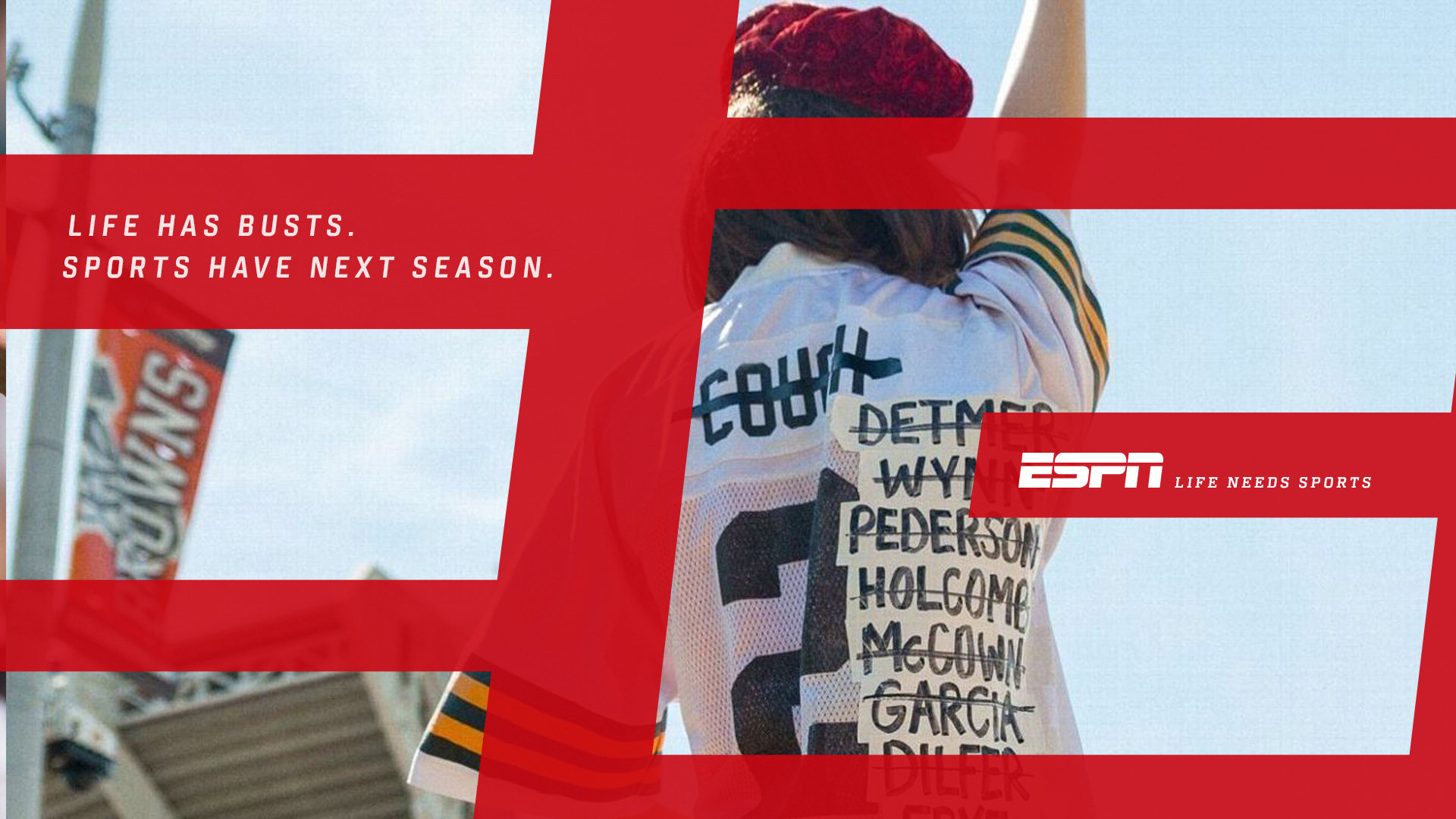
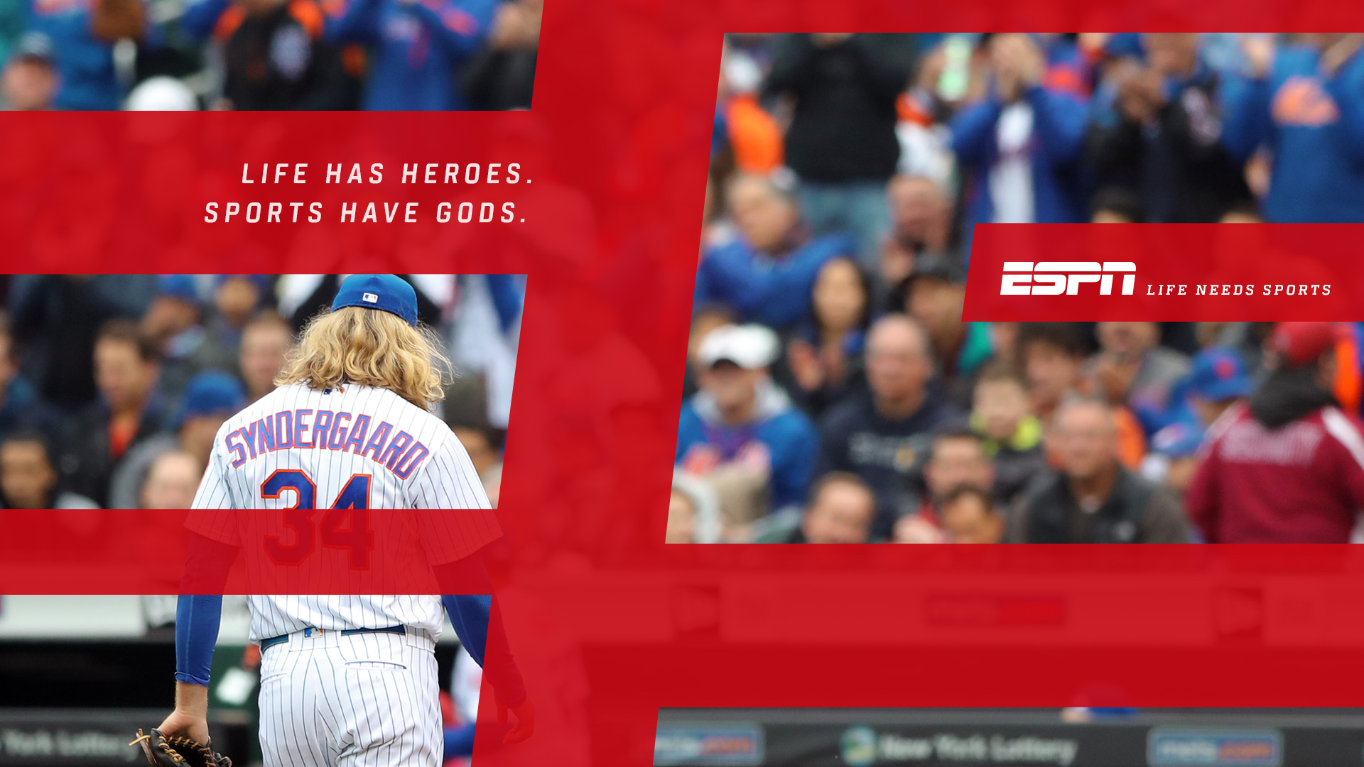
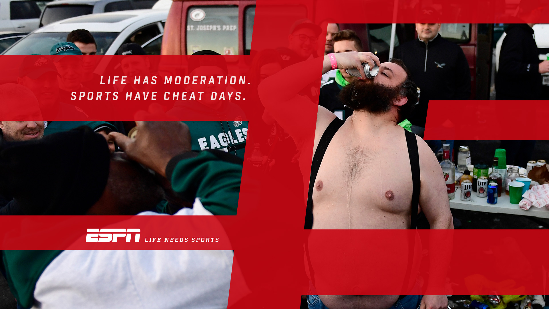
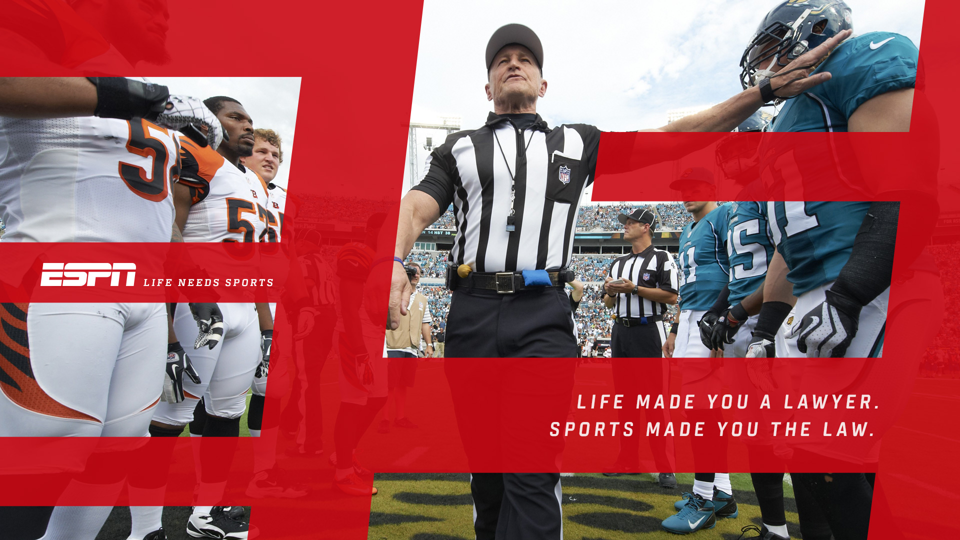
We helped them launch a global rebrand with the "Life Needs Sports" campaign, featuring a new tagline, a new design system, and, perhaps most importantly, a new attitude. ESPN needed to double down on the idea that had originally motivated them to build an entire media empire around people throwing balls and swinging sticks: sports are important. Sometimes they help an entire city cope after a tragedy. Sometimes they motivate politcal change. Sometimes they just make us happy on a bad day.